BOOK REVIEW ‘Cultural Connectives’ by Rana Abou Rjeily
May 27, 2011 Book Review
Keep up to date with IAM's special offers, giveaways and news in your preferred format.
By “simplifying†Arabic to make it more accessible Rjeily helps us to dissolve cultural barriers. The book gives us a fresh perspective and explains the differences between the Arabic and Latin scripts.
Published by Mark Batty Publisher, ‘Cultural Connectives’ is neither purely academic nor a teaching method - instead it is a reference for everyone interested in the subject. Whether you work in advertising, study type design, or are trying to understand Arabic and avoid common mistakes, this book is for you.
Publisher: Mark Batty Publisher
Page Count: 112 pages
Size: 7 x 9 inches
Format: Casebound w/dustjacket
Publication Date: February 2011
ISBN: 978-1-9356131-3-8
Rana Abou Rjeily holds a BA in Graphic Design from Notre Dame University and an MA in Visual Communication from Central Saint Martins, London. She now works as a graphic and type designer and is interested in researching and developing the tradition of simplifying Arabic.
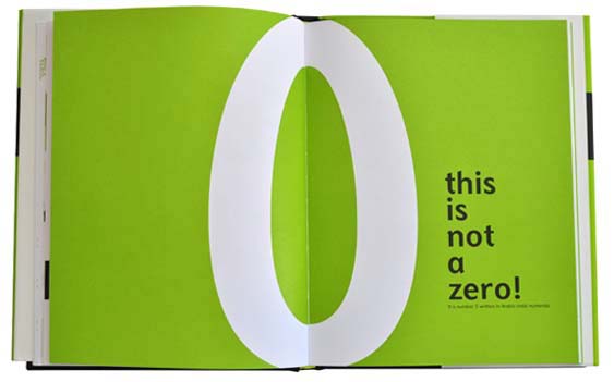
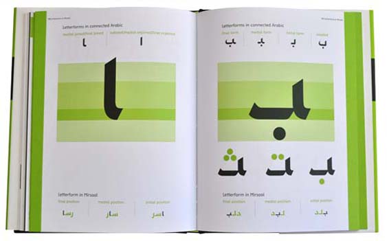
As a student at Central Saint Martins in London, Rana Abou Rjeily devised the font family Mirsaal, which comprises Arabic and Latin alphabets that work together in typographic harmony. Growing up in Lebanon speaking Arabic, French and English, she found Arabic, her first language, the hardest of the three to learn. In her design classes in London, her classmates were drawn to the calligraphic aesthetics of written Arabic, but they were not able to read the script; they just admired the forms. Back in 1947, Lebanese architect and typographer Nasri Khattar created Unified Arabic, a thirty-two character detached alphabet that, according to Abou Rjeily “was meant to ease the learning and writing of the scripts by reducing the number of shapes letters could assume.â€
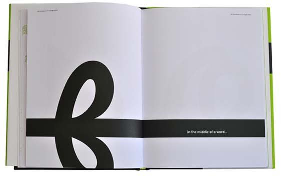
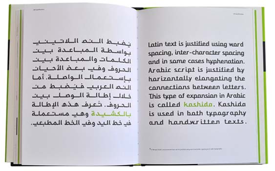
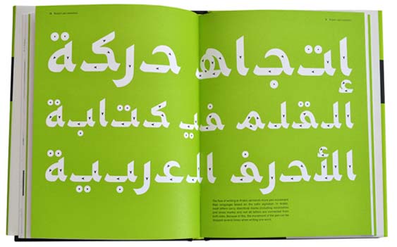
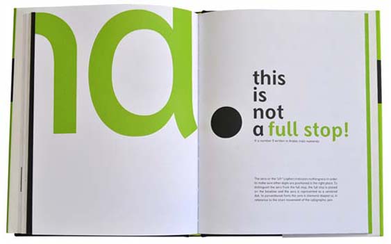
Mirsaal Arabic is a simplified typeface that carries the characteristics of a sans-serif humanist Latin alphabet typeface and still respects the essence of the handwritten form. The Arabic letterforms are inspired by the ‘naskh’ style; one of the most legible and simplified cursive Arabic writings. Mirsaal conveys the cultural essence and conventions of Arabic script. While Arabic is always written in cursive, Mirsaal removes its joined nature in order to attain a harmonious coexistence with Latin.
Comments
Add a comment